|
|
Visit Jeffrey Simmons Studio with photographer Klea McKenna, and writer/interview Nikki Grattan.
Klea and Nikki founded inthemake.com and are publishing these beautifully documented artist studio visits.
In The Make
http://inthemake.com/jeffrey-simmons/
Recently in New American Paintings Blog
Slanted and Enchanted: The Wonders of Jeffrey Simmons' Watercolors by New American Paintings
January 15, 2013
by Erin Langner
Recently in The Seattle Times
Jeffrey Simmons' fastidious geometries in watercolor
January 17, 2013
by Michael Upchurch
Read reviews about Jeffrey Simmons' recent exhibition NEBUL�:
 by Jen Graves/The Stranger
 by Suzanne Beal by Suzanne Beal  by Regina Hackett/Post-Intelligencer by Regina Hackett/Post-Intelligencer
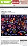
WHY JEFFREY SIMMONS IS A NAME YOU SHOULD KNOW
by Jen Graves / The Stranger
April 15, 2008
Jeffrey Simmons: Nebul� at Greg Kucera Gallery, April 3 - May 10, 2008
Let's begin by clearing up one fact: Jeffrey Simmons's paintings are, in fact, paintings made by Jeffrey Simmons. This is true in the most traditional possible sense. He uses paintbrushes, on canvas. Laboriously, he layers acrylic paint on and sands it down. That's how they're made.
It's necessary to make this point because people endlessly mistake these paintings for photographs. People also mistake them for images powered by electric light, plugged in, lit from behind, illuminated by some secret source besides paint. The people making these mistakes are only getting halfway there. The paintings do look like photographs in light boxes at first; it's the fact that they're not that sends the mind spinning. In order to get the full cognitive dissonance, you need the mistake and the fact, the illusion and the truth.
Simmons is a Seattle artist whose name you ought to know; he has been making interesting paintings since 1996. Right now he's having his fifth solo show at Greg Kucera Gallery, and it's called Nebul�, referring to the dust clouds that form stars and planets. The word nebula, nicely, is the root for nebulous, meaning fuzzy and indistinct. The things you see in Simmons's new paintings�brightly colored shapes that look like nebulae, supernovas, and other galactic objects, glowing on solid black backgrounds�do fuzz and vibrate a little at their edges. They're groovy and trippy, like op art, but they also, like the work of Gerhard Richter, play with the interdisciplinary blurriness inherent in all looking.
When Simmons first appeared on the scene, he was making turntable paintings. He used a rotating easel to make targetlike images of hard-edged concentric circles�the canvas moved instead of the artist, in what was, as Kucera says, essentially the opposite of action painting. Between the perfect, mechanistic lines, in well-defined areas, was drippy evidence of the accidental. For these he won a special recognition award from the Betty Bowen Award committee in 1996. Later, for his first show at Kucera in 1999, he built a machine that would rotate the canvas while orbiting a fixed point, creating lines that crossed back over themselves like children's Spirographs.
In 2000, he showed sharp watercolors that were made by elaborate overlaps of transparent colors. He's still doing these (a handful were shown at the Lee Center earlier this year), and they're almost unsettlingly masterful. There's a superhumanness to Simmons's control of paint, and in a 2005 show, he turned up the god-or-machine factor with imagery that looked like it came from aerial photography of cities at night or from computer screens. For the first time, the layered surfaces of his paintings were sanded perfectly smooth, like lenses.
The surfaces of the Nebulae paintings are smooth, too. Their imagery is taken from photographs of astronomical phenomena (and some of them mimic, in minimalist fashion, the grid arrangement of science textbooks). Behind the smooth surfaces are receding layers of depth. Shining out from the deepest point is the most vibrant color, as though it's been branded into the canvas and is still glowing. The other layers are full of hints that these are paintings about looking. Light appears to spill out from behind black shapes, as though something were curtained over or redacted; in other images, rows of black stripes over colored areas look like window blinds. One painting bears what look like the frame marks of a digital camera. Considered differently, these shapes and stripes are simple, basic, monochrome forms asserting their flatness in an environment preoccupied with depth.
These paintings also travel in time, like the stars they reference. Just as it's possible, because of the great distance, to see stars in the night sky that have actually, in real time, gone dead, so these paintings seem both products of a single, captured moment, and the accumulated results of an extended travel time over the duration of the artist's process. They record incidents and the residue of incidents; they're time-lapse paintings.
Which is true? What's truth in a painting, anyway? Simmons's works are down in the trenches of theories about painting here. Modernists called faithful imitation the greatest lie of all, and abstractionists of all stripes have claimed their works to be truer than mimetic scenes, more objective. In abstract expressionism, a true painting was one that was true to the emotional moment in which it was made, forging a link between painting and time that was more like the conventional link between photography and time�that photographs are made in a "decisive moment," as Henri Cartier-Bresson called it, when you snapped the great shot, kidnapped a part of the world before it disappeared from space- time forever.
When you put it that way, it's surprising that there aren't more great conceptual outer-space paintings out there. (I can't think of a single outer-space painting better than Simmons's.) Stars and night skies lend themselves more often to drawings, as by Sol LeWitt and Vija Celmins, which is understandable. Like drawings, with their eternal possibility of becoming something else (a painting, a sculpture), astronomical objects are contingent. We perceive them dimly. They are photographed but not seen with the naked eye, known about but not touched, and pleasantly beyond the scope of regular quantifiability or conquest. Paintings like that�like Simmons's�are fun as hell. recommended
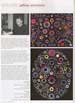
TWO ARTISTS EXPAND THE EXPERIENCES OF ABSTRACTION AT GREG KUCERA
By Regina Hackett / P-I Art critic
2008
The German essayist Walter Benjamin believed that all narration is obituary, as stories inevitably head toward the exit. Abstraction is a clean break from these beginnings, middles and ends, and yet in spite of a century's worth of trying to remove any associations external to the process of the artwork in question, associations remain.
Abstractions speak of time and memory, chaos and order, the origin of organic life and the purity of mathematics. Seldom, however, do individual artists cover the range of associative choices. They choose one, dig in and burrow away. That's not the job as envisioned by Michael Knutson and Jeffrey Simmons. Their work is rooted in both biology and math. It's blinded by science and awash in emotion.
Knutson opens in Greg Kucera's front gallery with soaring, elastic nets of sky blue and one checkerboard of black and white. He's an oil painter who makes soulful geometric grids, starting in the center and moving outward. His honeycombed grids within grids expand and contract like a bellows, connected to each other and cohering into a repeating sequence of larger grids. Despite the logic of his work, his paintings are robustly eccentric. Hexagons, cubes, stars and stair patterns interlock on a flat plane, retaining the illusion of volume.
Simmons' paintings don't look like paintings at all. They could be bizarre effects produced by a pinhole camera, back-lit X-rays of malignant mutations or star charts photographed in deep space and beamed back in a blur. They could be stained glass in a viral church. Like a serpent in an apple tree, they lure and repulse in equal measures.?
Simmons uses acrylic polymer emulsion on canvas affixed to panels, painting in alternating layers of resin with transparent and opaque colors and sanding them down.
He calls it hiding his tracks. There are no brush strokes here, no sign of the human hand at work, but instead of being coldly remote, his paintings bristle with overheated, biological menace. Jittery light coheres into coils and fans out into a sequence of sand dollars, half moons, dying batteries, sea shells and star bursts.
"If something is boring for two minutes, try it for four," advised John Cage. Both Knutson and Simmons paint the way sailors scrape barnacles off a deck, chipping away at empty space until it disappears into spiraling patterns. Their work relates to the larger community of abstract artists without being in anyone's debt. They dig in not to limit themselves but to extend their grasp.
Although they have little in common, they share the most important thing, a determination to reinvent the world purged of sloppy sentiment or chilly reserve. Instead of a single perspective, they offer a myriad-minded range of opportunities to see the edge of an experience open into a frontier.
SEATTLE POST-INTELLIGENCER
The following review is taken from The Stranger, January 9, 2008
Blowjob by Jen Graves
Recent review of Jeffrey Simmons' watercolor from "Unexpected Watercolors" at the Hedreen Gallery, Seattle University
There's no visual art section this week, but we'd like to take this moment to recognize Seattle artist Jeffrey Simmons's supernaturally controlled watercolors. They simply seem physically impossible,
as precise as if they were made in wet concrete. They scare us a little, seem a little Faustian. At the
same time, they're vulnerable. Unlike Simmons's acrylic abstractions, the fuzzy planes of color in
his watercolors look like they're disappearing, hovering the way only paint made from water can,
and interrupted by subtle light splotches, as if errant fingerprints have stolen away a little color
already. See one on the right.
The following essay was produced prior to our February 2003 exhibit of new work by Simmons:
We are pleased to announce our third one-person exhibition by Northwest painter, Jeffrey Simmons. Simmons’ most recent paintings on canvas flesh out themes and techniques first explored in his previous exhibition of highly-refined, intimate watercolors on paper. Simmons will also debut a new series of horizontal moiré paintings that continue his interest in superimposing two conflicting patterns to generate optical interest.
Primarily known for his ROTARY paintings of concentric rings of many bright, opaque colors, Simmons’ new RING paintings are more controlled and quiet due to his use of lightly pigmented acrylic media applied in painstakingly alternate layers of transparent and opaque colors. Often composed of only two colors but made of hundreds of layers of circles of various widths and depths of color, the paintings are built up slowly and precisely. By continuously over painting certain areas with different degrees of translucency of the same color while leaving other areas untouched after the initial base coat, the paintings seem to radiate light outward, and the surfaces pulse like ripples on water. The artist's usual palette of carefully chosen bright, sometimes caustic colors here is refined to reveal the subtle variance and power of meditation on a single color. The result is one of tempered complexity, each painting's grace and subtlety overshadowing their impeccable precision.
The MOIRÉS, like the RING paintings, are also a lesson in subtle contemplation and painstaking execution. True to the definition of a moiré, these paintings superimpose two conflicting patters, but instead of applying them on the same picture plane, Simmons separates them with a ¼ inch layer of clear epoxy resin, creating yet another layer of optical illusion to the finished pieces. Simmons begins by painting a wavy pattern in a single color on the canvas surface. Next, he builds up the surface with layer after layer of resin. Finally, Simmons paints small vertical strips of color on top of the resin. The two patterns interacting between the resin create a kinetic, ever-changing depth and wealth of optical fascination.
While exploring the complex possibilities and associations of color and paint application, Simmons acknowledges his art historical precedents such as Kenneth Noland, Jasper Johns, Brigit Riley, and Gerhard Richter. In addition, Simmons makes use of the lessons learned from optical artists such as Wojciech Fangor and Peter Sedgley, manipulating the way that certain color combinations, shapes, and patterns can affect the viewer on a physiological level.
I try to avoid pastiche when I confront the art of the 1960’s in my own work. I also try not to be overly sentimental. Still, I cannot deny that my childhood experience of museums must have a profound influence on the decisions I make as an adult painter. What I see in the pages of those 1960’s contemporary art books looks like a series of disused, neglected paths, each one offering to lead towards new and exciting possibilities. – Jeffrey Simmons
Simmons has been exhibiting in the Northwest since 1995 including a recent one-person exhibition at the Whatcom Museum, Bellingham, WA (2000-01); as well as numerous group exhibitions including: 4-malism, Bellevue Art Museum, WA (2000); Hands on Color, Bellevue Art Museum, Bellevue, WA (1999); Betty Bowen Award 20th Anniversary Exhibition, Washington State Convention and Trade Center, Seattle WA (1998); Seattle/Portland/Black/White, Seattle Art Museum Rental/Sales Gallery (1997); and Northwest Annual, Center on Contemporary Art, Seattle, WA (1996). In 2000 he was honored with an Artist in Residency Program at the Bellevue Art Museum. Simmons as awarded the Betty Bowen Committee Special Recognition Award by the Seattle Art Museum in 1996. His work is in the permanent collections of the Tacoma Art Museum as well as numerous corporate and private clients’.
The following review is taken from The Stranger, February 20 - 26, 2003 issue:
DOT DOT DOT: The Secret Life of Circles by Emily Hall
If you're still not convinced that what makes a work of art is not how much or how little has been done to it, there are two shows at the opposite ends of the spectrum that should undo you completely. They're also right across the street from each other. On the one hand, there is Jeffrey Simmons, whose circle studies fall mostly into the camp of op art, although not as vertiginous as some. His current paintings are thoroughly worked: up to 80 layers of acrylic paint, some transparent, some opaque, with sharp rings fading off into vagueness, just enough to make your eyeballs vibrate a little, not enough for seasickness. This work is controlled; any little accidental-looking blobs, you may be sure, are calculated, or at least considered. These are paintings you can look deep into, thanks to the layers--although I'm still surprised when someone manages to wring depth from acrylics--and sometimes the depth registers as elevation, so you're never entirely sure how reliable your eyes are.
A set of works made with copier toner fused (with a heat lamp) to paper enlarges the circle as platonic idea. Toner, as it turns out, is more powder than fluid--a quality Simmons exploits, here with high glittering ridges that spiral toward the center of a circle, there with matte pigment laid down like a tire track. One panel looks like a circle imploded into a cloud of dust. There's a narrative implied here, about a circle's infinite variations, its essential qualities (which have less to do with roundness than you think), something we've already accumulated and absorbed by moving around the gallery from painting to painting.
Simmons is also showing some vertical rainbow paintings where layers sit right on bare canvas, along with bi-level undulating paintings that offer a more substantial retinal challenge; but I was more interested in the universe of circleness (nova? lens flare? black hole?) that most of his exhibition offers. It would have been a tighter show without those distractions, and I wonder if Simmons knows it; a lovely, lovely little work called Borrowed Light, which consists of 49 Polaroids of a round light source in different colors, rather slyly declares his intentions.
On the other hand, there is Laurie Reid, whose work reveals how much can happen in a single dot of paint, and the relative merits of deliberation and accident. These are ideas that were rather thoroughly explored in the era of abstract expressionism, when paint's inherent paintiness (what paint, given proper freedom, would go and do) was on everyone's minds.
Reid's predecessors are Helen Frankenthaler and Morris Louis, who poured thin acrylic paint onto unprimed canvases to see what would happen. Like them, she explores the properties of paint, in this case watercolors--a medium pretty thoroughly confined in the public imagination to elderly weekend hobbyists, hardly the stuff of patient investigation. The properties Reid seems most interested in are precisely those you'd think you'd want to avoid: the way the paper puckers, the way certain colors separate as they dry, sometimes with thin, intense outlines around washed-out centers. This willingness to approach a medium's less, shall we say, attractive qualities, as well as an abiding interest in an often pooh-poohed medium, infuses Reid's work with game good humor.
That's only part of what makes it good. In one work, a set of light-blue dots--some smooth, some corrugated, some blobby, some tight--are self-contained entities in the top half of the painting, and in the bottom half they're uncontrolled spills, like long-tailed comets heading toward hell. You can read the liberated half of the painting as a wish, an alter ego, a dirty lie... a kind of secret life of dots. In any case, the two halves create a tension between liberation and constraint, between control and accident (and you'll go crazy not knowing which is which), that rather powerfully animates the work. This is one of the pleasures of such work as Reid's and Simmons': Much abstract work doesn't illuminate anything beyond itself, but this work shows you what your eyes and mind will go and do.
The following review is taken from The Seattle Post-Intelligencer, October 23, 2000:
Distinctive Artists Make Most With Minimalist Approach by Victoria Josslin
It's an odd thing, but minimalist artists, who often claim to work in the service of purity, can wind up making surprisingly sensuous objects.
So Sol LeWitt begins with the premise that "the idea becomes a machine that makes the art," follows his systematic plans, and creates works full of ambiguity and mystery. Agnes Martin's penciled grids seem to whisper and ripple. The hard-nosed empiricist Donald Judd becomes, as one wag called him, a "closet hedonist."
In two very different shows now at the Greg Kucera Gallery, Anne Appleby and Jeffrey Simmons each demonstrate the rich results of restraint and control.
Appleby works in rectangles, sometimes several rectangles hung together as one piece. Each panel is made of 30 to 40 coats of oil paint and wax, usually on wood, sometimes on canvas. She varies the colors, and we get glimpses of earlier layers on the sides of the panels.
Straight on, though, the works give the impression of having eroded away at the edge. There, we see a little more texture, and subtle changes in color. The middle is more opaque, and seems denser.
The titles make a huge difference in how we see Appleby's work. "Wild Clematis," "Spruce" and "Horsetail" tell us that the artist is drawing her pared-down palette from nature (she lives in Montana).
The three panels, one gray and two different greens, of "Lodge Pole Pine II," for instance, use color as a kind of code for the primary qualities of the plant.
The titles give the work the final shove into minimalist Romanticism. It's like religious painting with all the narrative taken out, leaving only the halo.
In Jeffrey Simmons' first Seattle show, at the Linda Cannon Gallery, in1995, he shocked us with spin art. Remember spin art at school carnivals? Here it was again, hanging on the gallery wall. Simmons is still working with spin art, pursuing two paths simultaneously.
Kucera has one example of the retinal overload path, "Bloom." The big, gorgeous acrylic painting is reeling around in the back gallery.
The rest of Simmons' paintings here, all works on paper, are the precisionist path. He's working with finely controlled geometric figures, mostly concentric circles. He's still spinning them, discharging the loaded brush on the turning paper, but now with the accuracy and focus of a diamond cutter.
Simmons is working in watercolor, and his palette is as finely controlled as his hand. He calibrates each stripe, for width, saturation and for color. The narrow bands of color are so regular that they look dimensional, like layers of colored paper, sliced through at an angle. He moves from groups of bright stripes through areas of musty, smoggy stripes, from small variations of color to extreme difference in color and in value. It's easy to read concentric circles as targets.
The unsettling outcome of all this fine muscle control and fine mental control is that many of Simmons' works read as the impossibly tidy leftovers of some violent action, as if the paper had been drilled through by a bullet. They're small, tense and stunning.
Although their products are very different, both Appleby and Simmons are working in a stripped-down language, in which every detail is magnified, every sensory stimulus exaggerated.
They will repay sustained looking -- impatient viewers won't find much.
The following review is taken from Artdish, November 7, 2002:
ABOUT VS. IS by Victoria Josslin
Last month I talked with dealers about abstract art. What I found interesting in those conversations was a variety of takes on the connections between material and idea. Must we set idea against material? Is reductive abstraction the idea side and gestural abstraction the material side?
Apparently not, as Matthew Landkammer made clear to me in an e-mail: From where I stand, he wrote, many of the abstract artists working in a 'reductive' manner seem to be extremely involved with material. Take, for instance, Anne Appleby. At first blush, her paintings are severely reductive, consisting of a single color on each panel. But this is not the case. There are multiple colors happening there, and there has been much skillful layering and glazing to achieve that lush glow that her paintings seem to have. The very materiality about her work is what first strikes me.
"What I'm getting at, I guess, is this: one doesn't need to goop the paint on to have a relationship to the material, and even the most reductive of painters may have an intensive relationship with the paint. That the viewer fails to notice is his / her loss.
Oh. Well, if you put it that way . . . yes, I agree. I still want, though, to talk about how the ideas and the materials intersect. Matthew and I spoke on the phone about "rigorously intellectual" abstraction and I asked him how we can tell that there's a concept at all in abstract work?
That's tricky, he answered. It's not as easy as the artist's statement on the wall, but a lot of what the public learns is going to come from print. The written word has become very important in visual art. In art school, it's not about skills, it's about theory. You can't expect the viewer to catch all the content from the artwork.
There's a lot of evidence backing Landkammer up – a lot of theory, a lot of writing, and a lot of extremely serious artist statements. When it comes down to it, it sounds like he places the real content of his work in the process.
While my works may seem divorced from the sensuality of the material, he wrote, the opposite is the case. It is only through a lengthy back-and-forth with the paint and sandpaper that I am able to achieve the final surface that is absolutely smooth. It's the process and the paint that I love, even more than the idea.
When I asked other artists about intellectual content in their work, all of them talked about process. When I talk about my own work, says Jeffrey Simmons, I tend to talk about how it was made, about the materials and the process. They're easier to talk about. When you remove other kinds of contents [narrative, figurative], there's still an awful lot left. I'm not sure where the sensual qualities end and the intellectual qualities begin.
Color is obviously an issue that I am interested in, and working abstractly has given me a platform to work on that. When people talk about color, or surface, the implication is that one is interested in pattern and decoration. Color is content and there is an intellectual component to it.
For Robert Yoder, the process isn't about skills, but it also isn't about theory – it's about getting it right. I asked him, Is there a concept behind what you do? Are you rigorously intellectual?, and he answered Yes, I am. Nothing gets made unless it's right. I do a lot of looking at my own work. It's the committing it to permanency that takes so long. If that's rigorous, then I am.
So, here's what I think. There are non-verbal ideas. Our minds are flexible and subtle, and we can respond on both a sensory and an intellectual level to visual constructions. We can do this simultaneously, and when we do it, we're using our minds in a way that we don't use them for anything else. Because we don't do this very often, it feels funny.
I think it's like, oh, I don't know, say skating. When you're skating you use your body, your various muscles, your vision, your balance, and your mind in proportions and in relation to one another in a unique way, in a way that you don't use them doing anything else.
When Robert Yoder describes his art, you see the flexibility and subtlety at work: I do consider myself an abstract artist, I'm making abstract images, but at the same time I'm really drawn to real images and have recently begun using real images in my art, but I'm not using them in ways that keep them as images. It's the real thing in the image – or the real image in the thing.
When Jeffrey Simmons describes his process, you see the same thing: I'm so involved in the way I'm applying the paint right now. [The work] will be a record of the making, but it will have other associations. My feelings about this change depending on where I am in the process.
After we finish looking at art, we want to talk about art, or even write about it, and the only way we have to do it is with language, and we should remember that our language will never be the equivalent of the work. It's just that language is the only way we know to skate around the art.
The following review is taken from The Stranger, October 15, 1999
VISUAL ART by Eric Fredericksen and Meg Shiffler
JEFFREY SIMMONS has for many years been one of the brightest emerging artists in Seattle, and with this show he takes a leap into impressive new territory, showing from three recent bodies of work. His abstract works have to date been created by spinning stretched canvas on a turntable as the paint is applied from a fixed point, creating thick surfaces of brightly colored concentric circles. The circles now move about the canvas rather than emanating out from one central point, creating a Spirograph effect. Some of the new works have a hypnotic moiré pattern superimposed on the circles, while others abandon the spinning canvas technique in favor of layers of transparent acrylic emulsion dragged and spilled in random psychedelic, abstract waves. Greg Kucera Gallery, 212 Third Ave S, 624-0770. Thurs Oct 7 through Oct 30.
The following review is taken from the Seattle Weekly, September 9 - 15, 1999:
Fall Arts Preview: Visual Art Picks" by Soyon Im
épatterns touched with silver, bronze, and gold metallic paints. The result: riotous color and texture providing the illusion of subtle peaks and indentations in the painting. Simmons has also produced a small body of abstractions dealing with irregular line work and miniature detail titled "Science Fiction Paintings." Borrowing both palette and imagery from sci-fi illustration, the works appear like tiny organisms viewed through an electron microscope. Greg Kucera Gallery, 212 Third S, 624-0770. 10/7-30.
|
